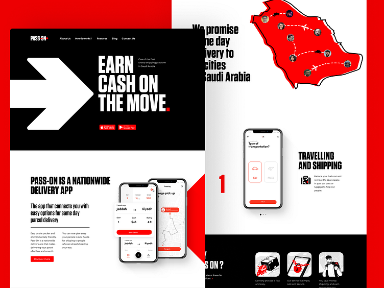
Pass On Application Landing Page
Take another look at a landing page designed for Pass On, the application that helps people to connect and organize deliveries conveniently. Nice, clean, bold, and scannable in the best traditions, amplified with solid color contrast, and adapted to look good on any device. Stay tuned to see more!
Also, welcome to read more about types of images in web interfaces and goals behind using photos in UI design, learn how to reach design consistency, and review the guide into basic types of web pages.
More by tubik View profile
Services by tubik
Like

