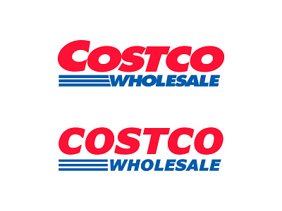
Costco Redesign
I rebranded Costco,
The logo always looked smashed up together. the font is too bold and the letters are too close.
I went with the same style font, but made sure it had enough spacing between the letters. I gave everything more breathing room and hoped to improve their logo by doing so.
More by Draxtor View profile
Like
