Launchpad Website design concept
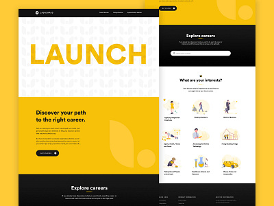
In the early days of the Launchpad rebrand, I created this as an idea of a 'what if', along with the logo that consists of a rounded shape and a circle that looks like an 'L'. It also looks like a leaf or flower symbolising growth which reflects the career growth of the students as they use the site.
