Financial Analyst Logo
So this was one of my favorite logo design projects. This is actually more of a personal brand than a company brand as Tal is the name of the client and she is the business more than anything. People hire HER more than the company so I did a lot of probing in to what makes her who she is. No matter the questions I asked she often brought it back to her cultural roots of being a dual citizen of the US and Israel.
This logo was nothing like she originally planned. Her original thought was something to do with numbers, analytics, and corporation and we explored that option but found it was so very generic. This particular concept was my "toss it at the wall and see if it sticks" idea.
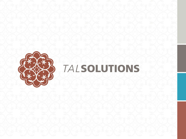
The concept behind the design: This design is based on the henna designs to give a nod to her culture. She has fond memories related to henna so this concept really spoke to her on a personal level. We needed to make it more than simply a personal connection so I chose to go with this "exponential" feeling where the pattern gets smaller and smaller into the center. The feeling that if you kept zooming in it would go on forever in the way fractal geometry would. Her use of numbers and being hyper analytical with it just made it all work perfectly. I included the small flower shapes to denote future and growth which is commonly used in henna to represent such ideas.
This design is my choice in typesetting. The client chose to go with a different typesetting, but I like this one best. I used Frutiger because it's beautifully proportionate and easy to read.
Always happy to hear critiques even though it's a finished project.
