Widget Filters
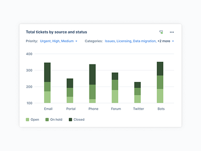
Showing filters on the card is always the best way to give context to the users who are consuming the chart. But at the same time, there might be too many filter values to show on the card, which in turn can make the UI cluttered. Showing "+2 more" kind of info when there's a space crunch and showing entire filter values when there's space would really solve this problem.
And in certain situations, the users might want to get rid of the filters completely, in such cases, the users can toggle the filter icon to show or hide filters.
More by Ruban B View profile
Like


