Auntie Anne's A Letter Monogram Logo Pretzel Mark Redesign
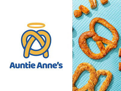


Auntie Anne's is one of the biggest pretzel franchises in USA, with more than 1.500 stores. They also have a very unique pretzel mark which I actually like but also think its a bit too crowded. Thats why I chose their logo to work on for this week's challenge.
I wanted to keep the pretzel as the mark but restyled it to look like an "A" letter as well. Also created it from 1 single line like how the pretzels are prepared in real.
Let me know what you think in the comments..
Please Hit " L " if you liked my work, helps alot 🙏🏻 Thank you for your support..
------------
http://www.designermurat.com
hello@designermurat.com
Need a new logo design? Email me or visit my website to see all pricing and packages I am offering in detail..