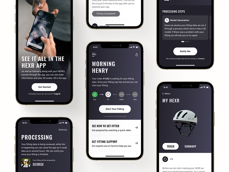
HEXR App Screen Designs
At HEXR, design research made it clear that our unique e-commerce journey was causing customers trouble when trying to understanding the current state of their order. We developed several features to help improve the visibility of customer orders, including: - Dashboard tracker and order state description - Order tracker and order summary views - Process descriptions (informing customers what we do) - Onboarding to explain the high-level process.
These efforts drastically reduced the number of "Where's my order" customer service requests—a big win for UX.
More by Mark Brown View profile
Like
