The Saudi Investment Bank - Landing Page
💌 Have a project idea? We are available for new projects info@ronasit.com | Telegram | WhatsApp | Facebook | Linkedin | Website
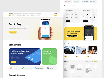
We are sharing the design concepts that we created for The Saudi Investment Bank. The Bank needed a modern-looking Homepage and a page advertising one of its products, the Travel Card.
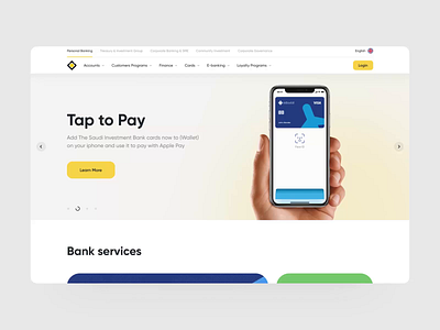
The shot shows the updated Homepage. It has a header with multi-level navigation by the bank services, language settings, and the web app login button. Under the header, there is a special offers/news carousel that the bank is currently promoting. Below, there is a block introducing bank services. Then, there are Stocks and Branch Locator blocks followed by a bright-colored app advertising block and a news block. The footer shows the site navigation and has a bright call to action button.
When designing a bank service page, it's essential to keep the balance between making the design trendy and conservative. The trendiness will make the design more appealing to younger generations. Still, people expect the bank to be reliable and secure, which we translate into the traditional or conservative visual image.
Stay tuned for another concept page that we designed for the SAIB.


