Quixote & Kids - Logo Inspired by Latin-American Culture
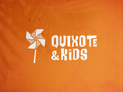
Logo for Quixote & Kids - a project looking to change the way Spanish is taught to kids in the U.S. by introducing them to the culture of Spanish-speaking countries.
The paper windmill was chosen as the main element of the logo, in an attempt to link the symbol to the famous Don Quixote scene while keeping the required playful spirit.
Accent elements were added to symbolize the longevity and complexity of Latin-American culture. Ancient civilizations such as the Mayas, Aztecs, and Incas - along with their symbolism - were researched and used as the foundation of the upcoming exploration for the brand’s symbol.
A handle was added to better link the concept to the playful look that was aimed for. The logomark was paired with a representative customized typeface that pays tribute to Latin-American culture.
Year: 2018
Sector: Culture & Education, Coffee Shop
Credits: Brand Strategy, Concept, and Art Direction by Costanzo Studio.
--
Your good fortune can be designed. Let's talk: eduard@studiodefalt.com
Follow Studio Defalt
LinkedIn | Instagram | Facebook | Medium | Pinterest | Reddit
