Jaguar I-PACE challenge
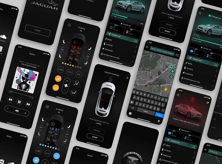
DECISION: I offer synchronization via Bluetooth, stationary unit, full set of functions) The advantage is that, unlike the InControl app, my app concept gives a complete media base — it's not only music in the usual mode, but also the ability to integrate applications such as SoundCloud, various messengers, messages from the phone, switching to a call. At the same time, you remain in the app. If you need to view any other files, etc., the application will remain active and will be displayed in a small window on the home screen of your phone. You can always go back without unnecessary activation, without losing the connected options. Once the interaction is over, simply swipe to the top like any other app 😉 . After analyzing the mobile application for "TESLA" and the redesign of the application from Matt Farmer, I conducted a survey of friends, one motorist whom I met at the car wash (Seryoga), a fan of cool cars, my brother, my own long-term experience and adapted it to the local market taking into account the climate zone and formed my Frankenstein 😉 (although there are a lot of screens for statistics and so on.. left on paper, do not forget that-this is just a concept)) In particular, in the redesign from Matt Farmer, there are solutions that are really more convenient than in the original "TESLA" application. The top important options are adapted to the main screen without a tabular form, in fact, what he writes in the summary (do not forget that Matt is from the United States, and everything is clear with the climate there). But there are issues such as climate control, heated seats, steering wheel, mirrors, and cooling… To fully connect the functions, you need to go to another screen (with a partial set of options, unlike the original "TESLA" application). In my opinion, this can be a problem for the layman, and not all the climate control functions are available on the duplicate screen of Matt Farmer. I also have questions about the interface. The design is done neatly in a minimalist style. This is cool, beautiful, and it seems to me that we need to move away from the stereotypes that the mobile phone is made of the same components as opposed to the design of the web interface. But! Icons, such as the charger (battery) and its percentage filling are too minimized, as well as the air temperature (in the interior of the interior, it is not immediately clear where the temperature is), starting the car with sign language and other questionable decisions. The positive thing is that you can immediately launch the map on the main screen and find your car, forgotten by the past day))) (very relevant for those who like to spend the night with a light)). link to the video: https://vimeo.com/526620783https://www.instagram.com/p/CMpY3ECFa-I/