DailyUI #002
C H A L L E N G E
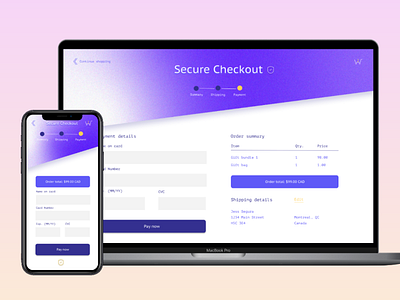
Design a credit card checkout form or page.
P R O C E S S
I started with choosing a colour pallet. From there, I started researching best practices for checkout pages, and sketched out a mockup. I tried to limit myself to only using Figma once again, but I really wanted to add some grain and more flexibility on the gradient for the menu banner in Illustrator. The colour pallet I initially picked out was too monochromatic, so I added a yellow accent colour for some of the smaller elements to give them more hierarchy on the page.
S O L U T I O N
I tried to keep in mind to have a one-page checkout and did my best to optimize the fields accordingly. For the mobile version, I felt that it would be too much to have a one-pager, and decided on that being a 3-step modal.
--
All assets designed by me.
You can check out more of my work at: https://madebyjsd.com/
