Roketing
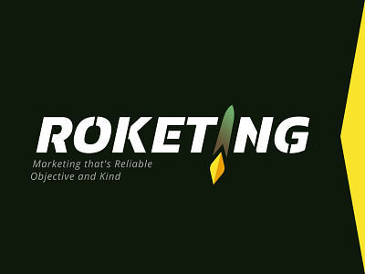


🚀The Roketing team offers marketing services that rock, so they needed a logo that rocks. We made this wordmark slightly slanted to give it a feeling of movement. The typeface is simple but still has a stencil look. We've created a stylized image of a rocket, adding dimension to it with a subtle gradient. The rocket is a part of the wordmark replacing the letter I and is accented with the firey yellow element. We think they are ready to shoot for the ⭐⭐⭐. ___ BEHANCE