Lake Clark National Park Logo

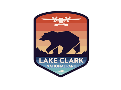
Logo design for Lake Clark National Park. This logo unites four things that are unique features of the park. Bear watching is a big part of the park experience, so it had to be part of the logo. I have added mountains because Lake Clark is surrounded by beautiful mountains. The turquoise color symbolizes the lake itself. Since the park is so huge and remote, most of the places can only be reached by air taxi, so the plane had to be on there too. I think I have found a good balance and didn’t overcrowd the logo.