Arc'teryx Website Redesign
I think my dad is one of Arc'teryx's biggest fans. So when I decided I wanted to try a little redesign project, I ended up on their website pretty quickly. Their website is by no means bad, but they do seem to include tons of largely irrelevant information that clutters the site especially on their product pages. The information overload makes it hard to see the important details and features over the less important ones. While I am sure if you are spending $300+ on a jacket you probably know exactly what you are paying for, the website does not help the user in the purchasing process.
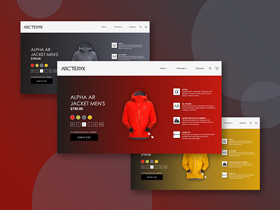
I decided I would focus my design on getting rid of some of the clutter and cleaning up the design a bit. The most important goal was to highlight the key features of the jacket which I did on the right side. On the left side, I kept the title, colours and some shipping information but took out the remainder. If a customer wants more details on the jacket they could simply scroll down and see for themselves. But designed like this, there is less intrusion of irrelevant information. I threw in the gradient as a background as well because I found their site to be almost entirely white. With a background adapting to the colour of the product a unique and more interesting experience is provided to a potential customer.
I think my redesign was a big success and am very happy with the final project. I believe my design highlights the important aspects of the product and maintains that clean look I was going for. This was my first attempt at designing a product page and overall I am very satisfied with my design.
I am in no way affiliated with Arc'teryx, but man, do they have some great products (and warranty too)!
