By Lindsay Nicole
002 / 100.
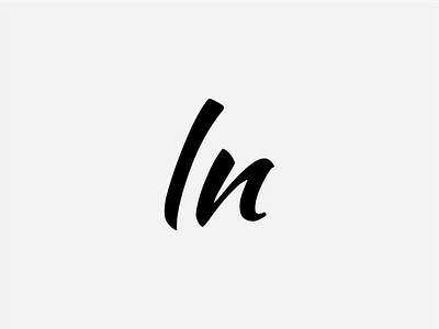
By Lindsay Nicole is a new lifestyle brand focused on baking and home design. Rather than fall into the category trap of a light serif typeface I chose this expressive script in order to stand out.
While it's clearly a lowercase L and N, the shape of the characters could be mistaken for capitals. Especially with how the lowercase N is in fact a reversed capital.
I love how it's built with letterforms but also appears a bit abstract depending on the context. This adaptability is what will give it range and allow it to live at any size across many different mediums.
More by wesjones.co View profile
Like
