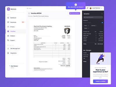
Dashboard - Invoice Processing Software
This was a tertiary page to see how our light / dark modes could interface with each other. Overall, we really appreciated the visual contrast between the two and think we'll just need to do some color tweaking from there.
What do you think? Let me know down below!
Learn more about me at: www.wesmerrill.com
Let's get in touch: wes@wesmerrill.com
More by Wes Merrill View profile
Like

