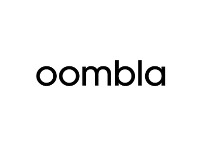
New logo for Oombla
Working on a new design and identity for Oombla. The typeface is ITC Avant Garde Gothic Pro. The emphasized roundness of the letters fit well with a name that has two o’s, a b and an a.
Interesting: The letters of the logo Herb Lubalin created for Bloomingdales is very similar to this typeface (also created by Lubalin) and at one point I was exploring the same treatment of the letters for “oombla” — that is, lopping off the spurs on the letters m, b, and a — which would have made it even more like the Bloomingdale’s logo, but ultimately decided it wasn’t quite what I was going for. And, as much as I can remember, all this work was happening before I specifically looked at the Bloomingdale’s logo, though I am sure there was some subconscious association happening beneath the surface because I had seen that logo multiple times prior to creating the one for Oombla.
