Hard Truths
Hello Friends,
It's good to see the winter starting to settle down a bit, Hope you all are hanging in there waiting for spring's warmth.
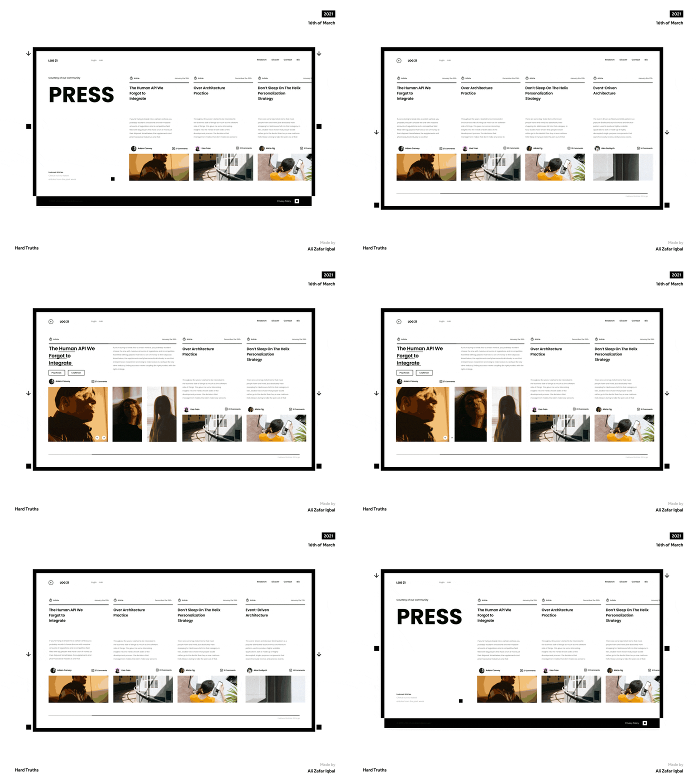
Sharing a work-in-progress shot from a recent client's explorations studies, related to organizing and showcasing articles and info sections into menu-based catalogs, allowing users to browse details of a catalog element before dwelling further into its respective contents.
Visual design-wise, I wanted to experiment with sharp brutalist visual elements to keep the design structure more in line with the product's brand image, while keeping only the necessary core UX elements within the info cards
I hope you like the interaction shot, do let me know how you feel about it, Personally, I think we can improve on the header area a bit more and try more iterations for the catalog's hero type. but it is up for debate.
Thank you for all your wonderful support, I always appreciate your insights, Have a great week ahead!
Press “L” to show some love ❤
Cheers!
