Bubulle Packaging | All in voluptuousness
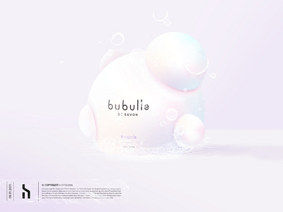
A packaging must transcribe all the values of the brand, its design and graphic line must be in total harmony with the logotype. Lightness, novelty and refinement are essential words that were used to create my Bubulle packaging. This lightness is defined by the pastel gradation found in the logo. It is combined with this soft touch aspect that takes us into a world of tenderness and delicacy. This soap seems light as a bubble. The packaging reminds us of the bubble, since it has a similar shape to this one. It is completely new, it attracts, intrigues and sets Bubulle apart from the rest of the usual soaps. The sleek design contributes to the refinement and prestige of Bubulle.
