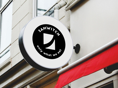
Logo design for Samwitch – food stall brand
Samwitch is a local food stall selling sandwiches in Singapore. Realizing that a great visual would help them stand out, they decided to rebrand their image with a new logo. My task was to design it.
This brand was highly product-oriented. That's why the client requested me to depict a sandwich in the design, as they already had a sketch.
I made two logo ideas: one depicting a diagonally cut sandwich with thick texture lines, and one based on the shape of a letter 'S' to represent their name. They didn't like either of these. That's when I made what you see here, a new and improved icon that was ultimately approved.
It wasn't that easy, though. The client asked for countless revisions and wanted to experiment a lot. I am happy with that, because, in the end, we discovered a great solution.
After finishing the logo, I put together a professional brand style guide. It included rules and recommendations about how the logo should be used correctly and to ensure it always looks good.
