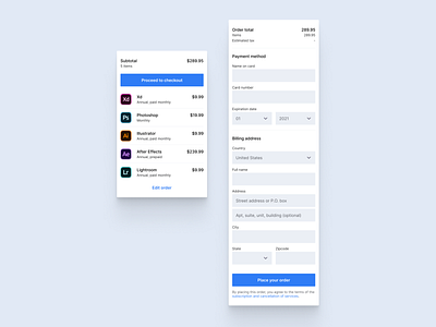
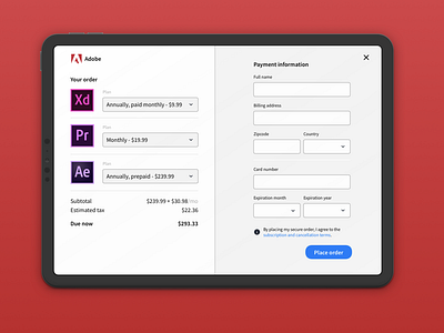
Daily ui 102 - Checkout remix
More changes here, including:
- Designed for mobile first - instead of iPad first
- Removed the ability to edit your items within the subtotal section.. Thought process here is that we would want to keep the user focused on their main task here (verifying their cart)
- The name of the application was added (duh)
- Added 'Name on card' field (another duh)
- Added secondary address field and city to billing address fields.. Not sure how I missed these on the first go round
- Swapped order of place order button and terms text
More by Katie Anderson View profile
Like

