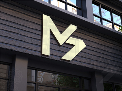
MEDOSTUDSIOS Logo Design
MEDOSTUDIOS is a group of creative and talented designers and developers.They are specialized in Branding, Digital Marketing and Web/Apps Design and Development based in Morocco. Their main principle is to provide modern, creative, high-quality deliverables. Besides, they create their own projects such as “Tabarro3.ma” and other.
The re-design is for translating their qualities into a suitable visual identity. What changed from “Old” MS to the “New” MS?
They re-structured their services and increased the quality of it, extended the team to include more creative people and started to build its own project wish provides a digital service that makes life easier for their users.
The old one contains a lot of shapes and looks unbalanced. Also, the shapes loos separated. The new logo is much simpler and looks balanced, And the shapes are united.
This transformation makes the logo minimal; in terms of anchors and color. We will use only 2 colors maximum instead of 4 (optimizing printing ink consumption).
The new design has sharp edges as an indication of balance, stability and structured.
