Lemlunay Resort Logo Identity ver.3
Design Goals: Likely target Market A, B and C.
Creative Solutions: Convey Chic and upbeat visual sense while sounded classy.
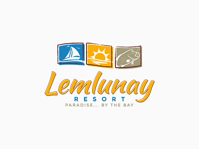
On the left imagery is a sail which they offer as there top renting services. At the middle is a sun which is always rising at the south. And on the right image is a fish called Napoleon wrasse which client insisted to add.
Fonts style were made manually and modified just to match the rightful adjectives given. While colors are selected based on a teal colors and earthy tones.
Logo concept is presented as draft.
Copyright: 2014 James Capisinio | All Rights Reserved
