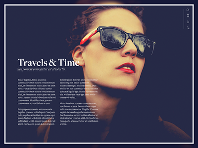
Medium Layouts
About 6 months ago, the Medium design team was playing with the notion of layouts. What if, instead of a single scrolling page, Medium stories were composed into "pages" and each page *could* have a rich visual layout like this one?
We eventually decided against it for a number of reasons, but the primary ones being:
1. We did a prototype that looked awesome...but each page felt too heavy. Instead of each piece feeling like a cohesive story, they felt like separate vignettes. It wasn't a better storytelling experience for most situations.
2. The overhead of creating "layouts" felt wrong for Medium. We wanted users to compose without worrying about layouts, required images for some layouts, etc. Layouts conflated authorship with the designing of page layouts.
3. Medium can be home to many types of content, from casual thoughts to complex, multi-part feature articles. Layouts pushed it far further into the longform, feature-esque and felt intimidating and overwhelming.


