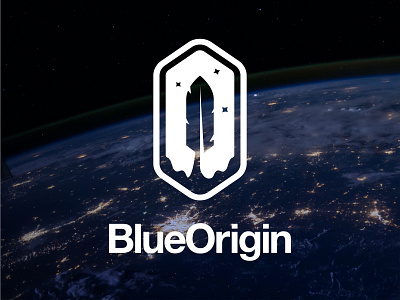
Space Rocket Company Blue Origin Feather Logo Mark Redesign
I believe space will be the most exiting industry for the next 10 years at least. There are great companies emerging currently. Along with Spacex and RocketLabs, Jeff Bezos' Blue Origin is one of them.
Although what they are achieving is phenomenal, the logo of Blue Origin is nowhere near the coolness of the company itself. They use a feather as the logo mark which is the core part of flying animals. It represents freedom, exploration, mobility and progress.
While working on the rebranding, I wanted to keep the feather as the core and build the new mark around it. In the new version, the feather is used in a more minimal way, also looking like a rocket launch. There is launch fire below and stars on top.
Please show some love, like the post and let me know your thoughts about the new mark in the comments👇🏻
Please Hit " L " if you liked my work, helps alot 🙏🏻 Thank you for your support..
------------
http://www.designermurat.com
hello@designermurat.com
Need a new logo design? Email me or visit my website to see all pricing and packages I am offering in detail..


