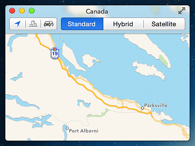
OS X 10.10 Maps.app (Concept)
This is a purely personal, aesthetic concept of the direction I'd love to see OS X take. I've shrank the UI to fit the preview. View the attachment for the full UI, including some other elements.
I've given the elements a touch more breathing room, updated the typography to Helvetica Neue, simplified the window controls, utilized a slight blur where I think it makes sense and smoothed out the controls and colours.
I've kept the depth, highlights and shadows as I believe they're necessary in order to provide context and spatial awareness in a desktop UI. I would hate to see OS X go as bare and flat as iOS 7 :/
Be sure to check the @2x.
More by Jordan Borth View profile
Like

