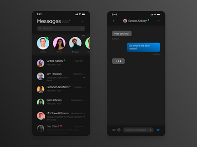
Daily UI 013 - Direct Messaging
Prompt:
Hint: Design a Direct Messaging app, profile, or chatbox. Consider the parties involved in the messages, images, placement, and context of the messages. Are the messages for social purposes? Customer support?
Solution:
This is usually done really well and is so common that the room for innovation is slim, however, I think having a known status on your friends is a fun opportunity in messaging that can help you to reach your friends at times that they're available.
This isn't a huge hurdle we're solving via UX considering most people read texts asynchronously anyway. But it seems like a nice-to-have that enhances communication in my opinion. I also diverted a bit from the clear IOS inspiration and allowed more room for messages - that's the point of messaging apps so I wanted to keep that priority throughout.
Thanks and let me know if you have any feedback. I'd love to hear from you!
