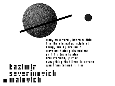
Malevich Font
More: https://readymag.com/u2755240640/malevich/
The project inspired by suprematism, Bauhaus and Malevich. When simple forms express dynamics and emotions. In this project abstract forms speak in the form of a font.
Idea of the project: to check the possibility of creating a readable font that consists of simple shapes, which can use for writing small texts. How abstract letterforms can be. Letter by letter, the font was created, combinations of letters were checked, and how homogeneous the text looks in a large volume. How the text looks in small and large print. The letters had to be simple but recognizable at first glance.
It really was a challenge, it seemed impossible and it made the project interesting. Some letters were easy enough to reproduce, but the most difficult were the letters "s" and "z," and it took a long time to experiment and make variations until the most appropriate shapes were found. Combining the letters into a font was not difficult, but when testing the text in the case it turned out that the font was not perfect enough and after creating the font I had to redo some of the letters in the font.
The font was produced in graphic applications and assembled into a font using the Gliphs Mini app.
