Company Logo
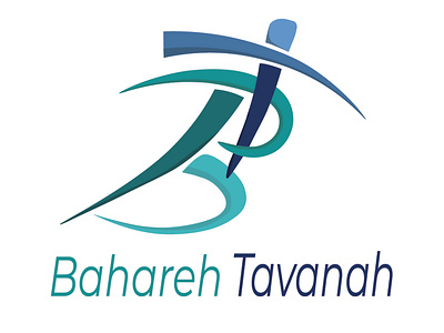
I was asked to design a logo for this company (physiotherapy). I started with some figures of people running and quickly saw that it could resemble a "B", thus the B in the logo is a running man, and the "T" is naturally a person doing Yoga and healing their body. Everything corresponding to the market and business.
More by Arta Ekman View profile
Like
