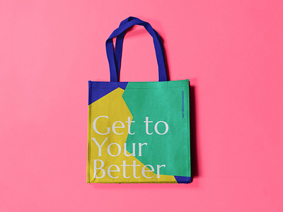
Cosmo Brand Identity
Cosmo Concierge is all about meeting clients where they are. Everyone's story is different and just as messy as the next. Cosmo takes a personal approach to finance - building relationships and tailoring solutions.
The art direction that we create Cosmo is based around the use of unstructured geometric shapes. These are used to represent each clients story while giving a nod to wadded paper - a symbol of the frustration of budgeting and bookkeeping.
We also saw the value in showing smiling faces throughout brand applications. "Get To Your Better" was a common phrase spoken within the discovery process for this project. We wanted to show people at their better - the result of partnering with Cosmo.
More by Andrew Wiseman View profile
Like
