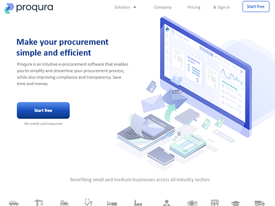
Blue illustration for suppliers website
My illustration is about how supplyers can modify their paper work into online processes by Proqura app.
They save their time and money by this app. The client wanted to get minimalistic isometric images which will show how their app works (and based on their corporative color palette)
Is it clear in the illustration about what the client wanted to tell by it?
I will be happy to know your opinion about colors and harmony of many elements as well :)
More by Anastasia Melnikova View profile
Like
