Branding a tour company
The logotype took endless revisions as the client was not satisfied with any options based on personalised fonts. Therefore I crafted a handmade lettering type, dusting off my calligraphy skills 😅
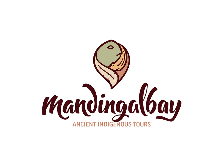
The main goal was to redesign a simple mark that would maintain the cultural value of the indigenous inhabitants, keepers of the land, and tour operators.
Here are the 5 elements included in the mark: • Saltwater turtle - Symbol of earth • Freshwater turtle - Symbol of fauna • Cockatoo feather - Symbol of woman • Wait-a-wile (a local plant) - Symbol of flora • Scorpion - Symbol of man
Check out the full case study here.
Hit "L" to share your appreciation.