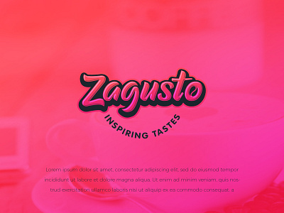
Zagusto
A fresh, modern, and standout logo (with a premium look) for a Food and Beverage distribution and retail company. The idea is that the brand sources unique and high-quality/premium products that tantalize the palette. Coffee is one of Zagusto's main products, so we modified the letter O to look like a coffee bean. The tagline is curved to convey an impression of a smile.
_______________________________
Are you looking for a logo (re)design for your business?
I’d be happy to hear your story! Feel free to reach out!
More by FullStop View profile
Like
