City of Coppell Brand Identity
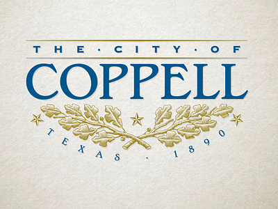
The logo is based on the history and heritage of the town and includes custom-drawn crossed post oak branches, three stars and the date the town was first called Coppell. The letters of the typeface is also customized but based off of late 19th-century type styles. The post oak branches, resembling old line engravings, give the logo its foundation. The crossed arrangement symbolizes unity and solidarity. The post oak tree was selected because of its dominance at Grapevine Springs Park (a historical landmark), its size and longevity and the fact that the wood was used as ties by the railroad. Many claim the railroad put Coppell on the map. The three stars are reminders of three important names associated with the history of the community, Grapevine Springs, Gibbs Station and, of course, Coppell.