RMS Update
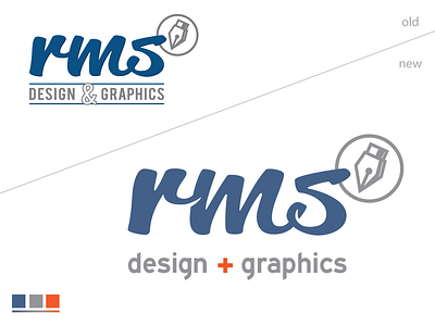
They say designing for yourself is the hardest thing... and its true... but I'm very pleased with my little update of my own personal logo. I added the little "shadows" for easier reading and instead the & I did the + (in orange for a little Dutch design)... The + will also change colors depending on what sort of graphics/work i made or if the + stands out to much or not at all. Also removed the lines to get a cleaner overall look.
Let me know what you think of it?
More by Rien Schijffelen View profile
Like
