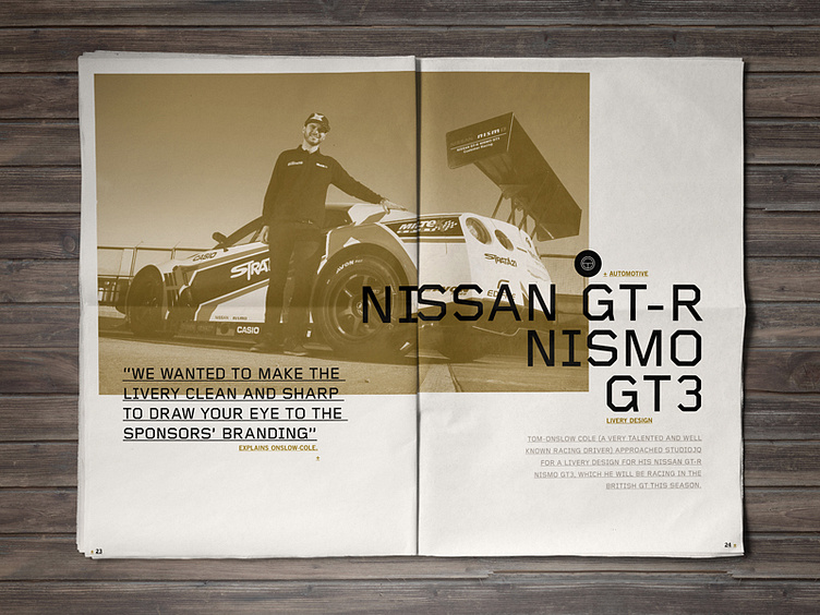
2014 Portfolio // GT3 Spread
Development of my brand refresh and portfolio review layout as a newspaper mock up. Hugely influenced from Swiss style design focusing on big typography, overlapping and a strong accent colour. I have had to revise the spot colour as the printer in mind doesn't produce spot colour printing which is a shame.
Follow the development here: https://www.behance.net/wip/413971
More by MadeByStudioJQ View profile
Like

