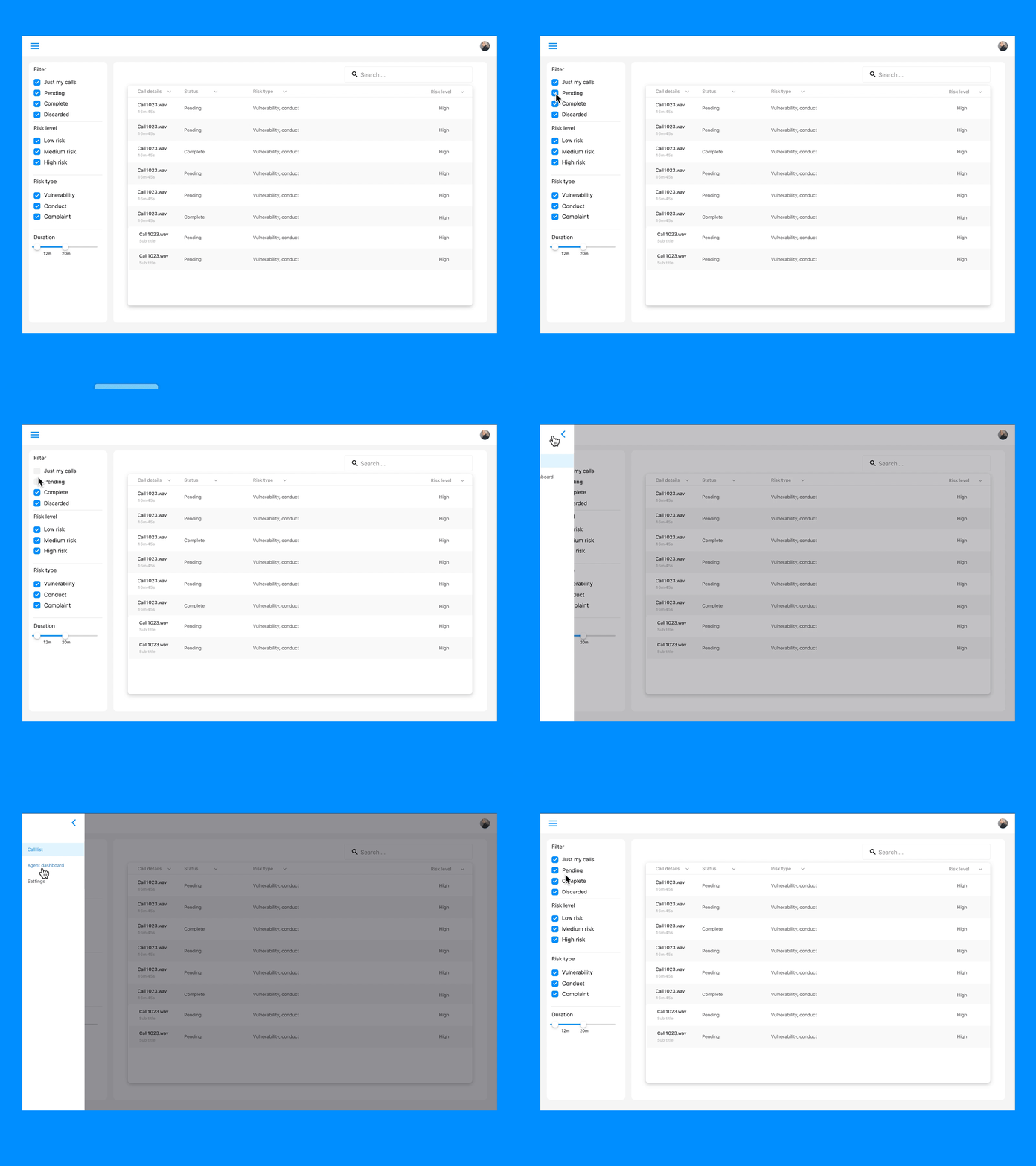
Call list with slide out menu
A slide-out menu solution to a new call list layout. We initially had a floating icon menu but the filter panel looked heavy and out of place next to it. Hiding the menu allows the user to focus on the data table and preserves horizontal space, giving everything a bit of room to breathe!
Tell me what you think!
Created with Framer :)
More by Mhairi McGinlay View profile
Like
