SFU SIAT Logo Redesign Challenge

IATSU (Interactive Arts & Technology Student Union) proposed a fun design challenge for students to reimagine a new logo for our program.
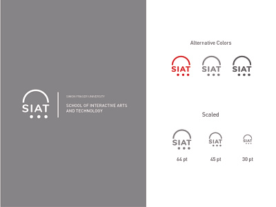
SIAT is know for it’s multidisciplinary take towards design with 3 core concentrations in Media Arts, Design and Interactive Systems.
The 3 dots are interpreted to be the concentrations, the root of SIAT’s academic program. Above it’s name is an arc that encompasses SIAT’s ecosystem, but also represents a boundary that SIAT students push against with the roots of their education.
Welcome feedback on how the effectiveness of how my design communicates with the audience!