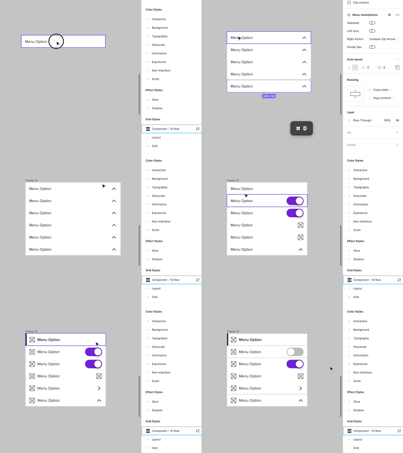
Menu Component
Daily Design #11
Working on creating variable and responsive components with Figma's new auto layout and variable features.
A menu system for creating primarily side-sheet menus on mobile devices. (though these can work anywhere)
The purpose was primarily to create a component that the designer could use to realize any type of menu that they might come across on mobile devices. Whether it is in a hamburger menu sheet, or a specific page of options, this allows the designer to stack a bunch of options together, set selected states, add icons, and actions to the right and left sides, and to group them with divider lines.
An update to this that will come soon is to create the rows that will serve as the content for the options that are hidden within the Collapse/expand arrows, as is common with our menu systems. These will be indented more.
The entire component is also 100% responsive (width) as well and works well inside an auto-layout stack.
