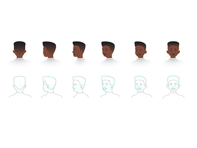
Google Skillshop styleguide facial poses example
This was another visual included in the styleguide for the Google Skillshop illustration style that I created.
The styleguide was treated as a manual to use by fellow illustrators or external creatives in order to draw our characters correctly. Placing their eyes and other features in the right places to adhere to presenting each of our characters in the best possible way and maintain quality throughout.
The following slide shows how we move the body in different directions and how the pose of the character should reflect this to be realistic.
The last slide show we scale a full scale illustration to a spot illustration and what elements are kept in and which are omitted to communicate the most important feature of the illustration and its message.


