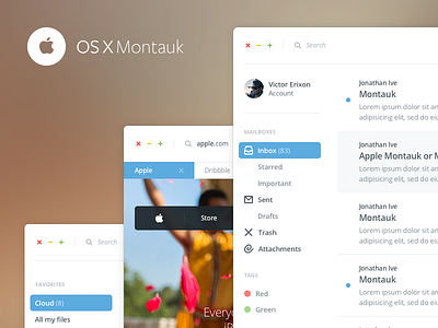
Apple OSX Montauk
During easter I took a stab at visually redesigning the Apple OSX. I wanted to strip off all the clutter and move the OSX into a cleaner direction. I still kept some layer effects, I don’t want to be too controversial.
Since designers hold Apple very dearly, I expect a lot of criticism.
Note: This is not perfection, this is a visual concept. And in order for me to achieve the same results as Apple I would need their researchers and their experience. I've had no time digging deeper into the UX just for a fun easter redesign. Also keep in mind that the focus might be difficult since none of the inactive windows are dimmed out in lower opacity because I want to show how they all look without hiding them.
Credit to Tim van Damme and the Dropbox/Mailbox team for being a huge inspiration.


