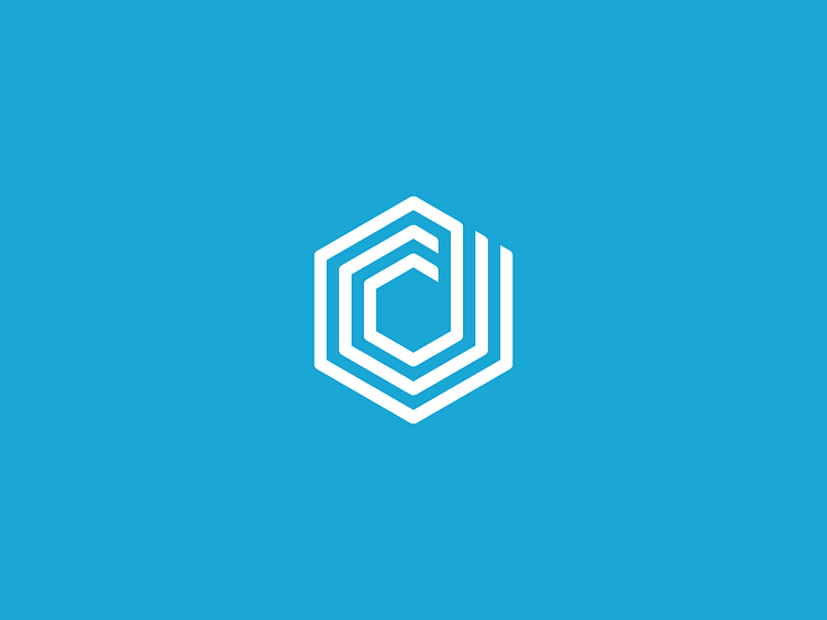
New Dunked Logo
@Orman Clark Asked my to design a new mark for Dunked 2.0, which they quietly launched earlier today: http://dunked.com/
Dunked makes it super-easy to create your online portfolio without any technical know-how.
They wanted a geometric mark that looks strong, and works on its own as an icon. Because the lines and space in between are the same size, it is really easy to scale to logo and keep it pixel perfect.
Let me know your thoughts!
More by Jord Riekwel View profile
Like
