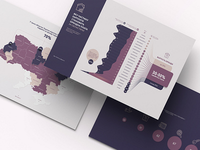
Renting & Salary Statistics Infographic
Infographic design based on regional data comparing rent prices and average salary level. The visualization was developed to show the share of wages that is cut by rent and rank the numbers by the region.
More by Natalie Zuieva View profile
Like
