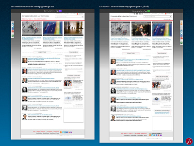
LexisNexis Communities Homepage Designs
Homepage designs for the LexisNexis Communities. Showing rv1 and rv4 (final).
Although subtle, there are many differences.
LexisNexis' websites were always very heavy on text, there was always a lot of information to display at all levels of any of their sites, so I tried to keep things simple and let the text flow with minimal restrictions or limitations, otherwise the sites would be very hard to maintain and prone to break easily.
That's how I learned not to mess with text too much, when it doesn't like something it starts breaking stuff :p
They always wanted to see the design of the dropdowns. Dropdowns were a major UX requirement back then, it was a UX nightmare, as you can see I even had to consider scrolling inside a dropdown, ouch! But it was either that or no access to the content for the user and that was unacceptable.


