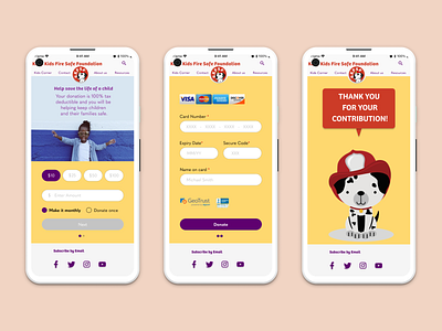
Donation checkout/payment mobile page
I prioritized all the important call to actions from top down, and divided into two screens to add wiggle rooms. I sticked with the color scheme: yellow, red, and purple. Red was a must, since this is a fire non-profit organization. However, I needed to be extra careful using red because it can be read as an alert, and alarm. All the pictures are from Google Images + Unsplash, which I do not own.
More by John Nguyen View profile
Like
