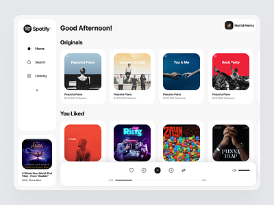
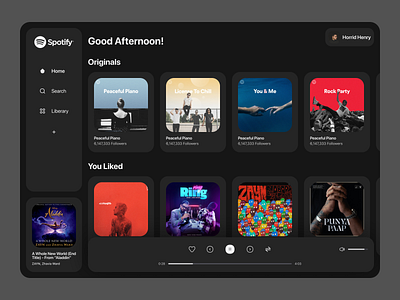
Spotify Redesign (White mode) Concept
This is the rebound shot of my previous Spotify web dark mode redesign concept.
most people love to use dark mode in their apps and sites. but there are also some people who still prefer to use default white or day modes. so that's why I made a white version of the concept. hope your guys like this shot by pressing "L". and show some love in the comments below.
Or If you want freelance work I'm here. check out my portfolio here: https://faizanwar.netlify.com
Thank you.
More by Faiz 🍉 View profile
Like

