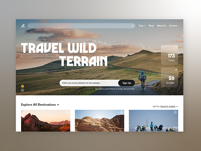
Daily UI 001 - Biking Trip Sign Up
My first Daily UI challenge to improve my skills started with a sign up screen! I decided not to go full modal or form because I really wanted to try out a new trend, the glass effect, which I had never had any reason to use before. The key was selecting the right imagery and I ended up adding an accessibility button that could be clicked to change the background to a solid color - hypothetical functionality. Also I used my favorite font, but going forward I am going to try to step more out of my comfort zone and aesthetic.
Anyways, I had a ton of fun designing this concept screen. Stay tuned to see the rest of the 100 days!
More by Madeline Mills View profile
Like
