Minimal Website Landing page
Website redesign for www.rescuetape.com/. Challenge given by @ransegall
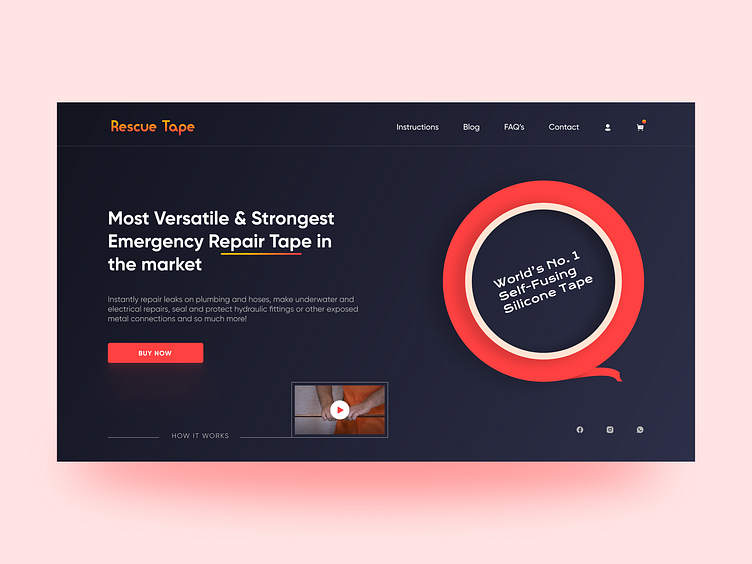
Here are some major changes I made to give it a modern and minimalistic look.
1. Changed the logo text to a rounder shape to reflect the physicality of a tape though maintained the color. 2. Limited the noise as there was a repetition of data in the old design 3. Made a simple illustration of tape and emphasizing the superiority at its core 4. Added a small HIW video snippet that can tell the user about it in the most efficient and quickest way. It was originally there on the website but the placement was incorrect.
Hope you learned something from this insight 😊
Happy Designing!
