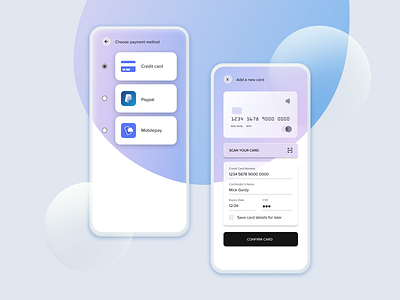
Credit Card Details UI
Today I learned a lot about the different flows of adding and confirming a payment. I noticed that the most popular option to adding a card was a pop-up window, so that users would not be disturbed during their checkout process. If they would already have a saved card, they could skip this step in the future. Before the screen "choose payment method" would be the checkout overview, and after adding a card, user would be redirected back to the ordering page to confirm and purchase order.
What do you think about the finished result?
Please take a few seconds to leave some feedback before you go! 😊
More by Emilia Perttu View profile
Like
