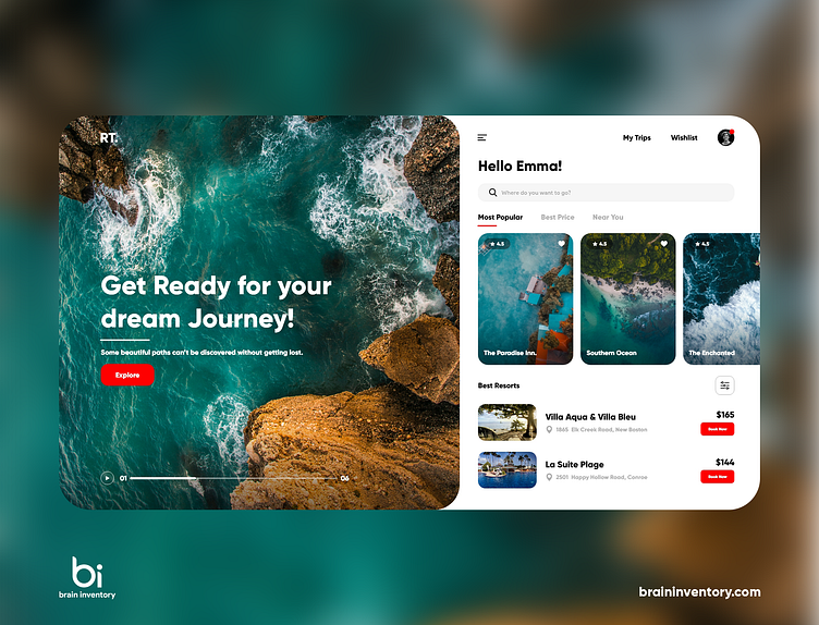
Travel Web Application Design Concept
We miss the times when we traveled a lot, so do you, right?
Our latest design concept is for regular travelers. With this web app, discovering the hottest travel destinations is never a headache. Check this out!
To achieve easier viewing, we decided to split all travel destinations into categories. Plus, it’s a good way to minimize ‘where should we go?
For travel apps, red-orange is a popular choice. We’re never afraid to experiment, however, for this work, it was decided to rely on the best practices. To boost performance, we also included cold-filtered travel pics in the UI.
Created by @imkrishagrawal
Feedback helps us improve and grow, We’re keen to hear your thoughts! Got a startup idea & an amp; need to get it validated?
Let us give you our honest opinion. Book your FREE 30 minutes consultation with us at sales@braininventory.com
